
That Beautiful Neutral Palette


 When the three primary colors yellow, red and blue are mixed together, the result is brown. There are infinite varieties of brown, depending on the proportions and intensity of color, but it is always a result of mixing the three primary colors. Add white to the mix and you have delicious beige. 


      A neutral palette, then, is one where this mix is achieved. The neutral palette is the one preferred by nature. 


     In January 2002, scientists at John Hopkins University announced that they had discovered the color of all the light in the universe… and it was beige! The color was quickly renamed “cosmic latte” by the team. 

     In celebration of all things neutral and brown, here are some of my mixed media pieces from the ongoing series "Of the Woods".
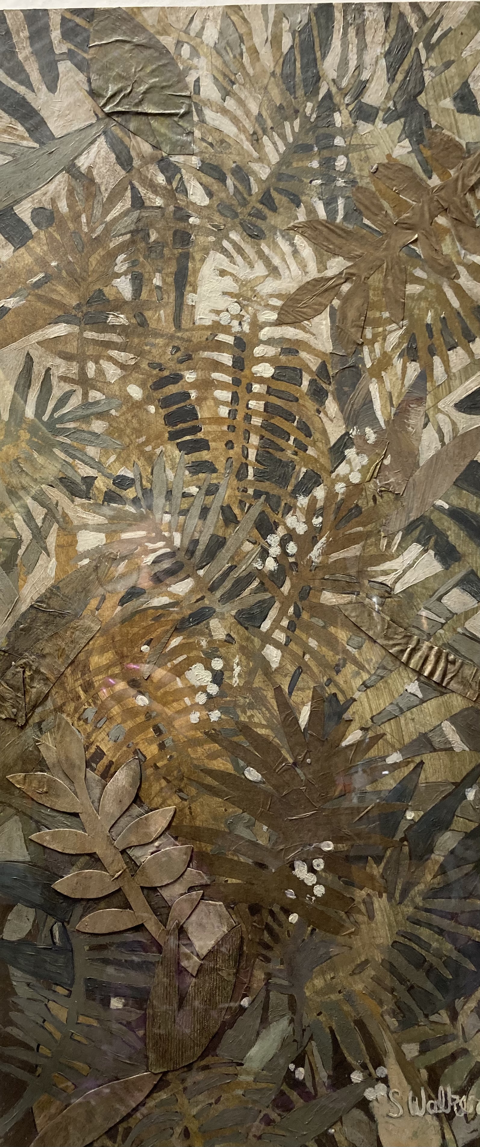


Ferns of the Woods 
20 x 32


Sage Green 
20 x 32


Tawny
8 x 10

Patterns 
8 x 10

For information or to purchase, visit my shop 

I wish you a healthy and prosperous new year, 
and look forward to seeing you again 
at one of my 2024 art shows. 


Comments

Popular posts from this blog

January Line-up

 Look what's coming up in the new year! First up: Artful Journaling. Guests will receive a blank journal of watercolor paper, access to all kinds of art supplies, with limited instruction and demos. Snacks, coffee and lots of laughter will be provided.  Next up: Relax, Unwind & Refresh. Great way to start off the new year! Guests will be making a frameable art piece at the table with friends. Wine, sparkling cider and charcuterie board will be provided. Also this month: Art Class, every Thursday afternoon from 1-3 PM. Bring your own artwork in progress or join in the group project. Coffee and snacks, limited instruction and plenty of camaraderie will be provided.   Register here  for any classes or events. See you soon!

Big News!

      For awhile now I have been thinking about sustainability with my work.  As in, how long can I honestly sustain this pace of doing art shows all over the midwest? Which I love, mind you, BUT. You may not know this but I'm not getting any younger! The gamble with shows is that, even with the best preparations, it may not be worth all the trouble. It could be a great show, with sales non-stop, or the opposite, with barely enough to cover expenses. And whether great, good or bad, it still requires the same immense energy. Not to mention gas, lodging and food. I am not complaining; I've had a pretty good show season. That being said, I have been thinking alot about sustainability.        I'm also thinking ahead about the daily routine of going out to the studio (which I love) and starting the  fire in the woodstove  (also love) and then waiting the hours it takes to get it warm enough to work.  Add to that how the groundhogs have m...

Visual harmony

One way visual harmony is achieved is by use of color. Colors harmonize when they are similar to one another, either in their tone, tint,  or hue. Even contrasting colors harmonize with each other when they are balanced by size, shape, direction, line or texture. My lovely client came into my booth wearing a fuschia scarf with a geometric pattern. We found earrings to harmonize her look. The earrings are similar in color and line.  How do you think we did? What would you do differently? To see more jewelry pieces that harmonize, go to sandyartparts.etsy.com