
How do you make gray?


How do you make gray? Well the obvious answer is to mix black and white.


But then how do you get a reddish gray, a bluish gray or a warm gray?

I was once commissioned to make a detailed color chart for a color consultant. That was when I learned how to make gray.
   
     For those of you not in my age range, let me explain. Back in the 80's, everyone was getting "their colors done". You were analyzed as being one of the four seasons, as far as the colors that look best on you. The palette was based on your skin tones and the color wheel. 


The left side of the color wheel is the cool colors, or the winter palette, and the right side is the warm colors, also known as the spring palette. But what about the warm muted colors of autumn and the cool muted colors of summer? Where do they get those colors? 

The color wheel holds the key. Take any color. Let's take red, for example. 


Okay start with red and draw a straight line down to the opposite side of the wheel and what do you find?  Green. This is its complementary color, and here's the deal. Any two complementary colors will gray each other down. So start with red and add a little green and you get tomato red. See the difference? It is a grayed down version of red.  Now if you continue to add green you will gray it down even more. 


So now if you take white and add a bit of your grayed down red, you will get gray, but it will be a lovely shade of rich, vibrant, reddish gray, instead of the dull black and white mix. 


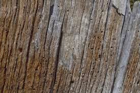
So next time you want to paint tree bark,  you will know how to make its beautiful muted warm color palette.


Complementary colors are harmonious when blended because they gray each other, giving a  more natural effect. 

What about yellow and purple, you ask? Yes, they are complementary colors and yes, mixed together they make gray. Here is a beautiful example of using complementary colors in a painting. It is called Dawn Beach by artist Fred Cuming. 


The yellow of the sky is muted down with violet. The deep cool violet on the horizon is muted with its complement, yellow. The effect is soft and harmonious, a lovely blend of total opposites. 

So how do you make gray? Black and white works. Or any two colors opposite each other on the wheel, plus white. 

Comments

Popular posts from this blog

Where it All Started

    I have always believed that people love to see behind the scenes in the artist studio. It’s like looking behind the curtain and seeing what goes on backstage, to see how the art is crafted, what tools and materials are used, and how the artist thinks.        To this end, I am thrilled to unveil a new video that tells my story of the origins of Parts of Art.  A big shout out to the producer and videographer   @Moguefilms .                                           Here are some of the pieces seen on the video.                                              Want to see more?                                           visit my shop here    

Just add paint!

      It’s just that simple when painting with watercolor.  This is how I start my day in the studio. Open to a new page, fill a brush with sparkling clean water, and fill the page or pages. Then, add watercolor paint and let it do its thing.              The daily studio routine is this:  clock in at 9 and paint that page in my journal.       I realize that the painting on this page could become a beautiful fabric design, a batiked collage, or an amazing painted wall hanging. But my POINT is that I start my studio day with water on a page and go from there.           As far as the illustrated journal, yes it’s true. Any thing done on these hallowed pages could become some great masterpiece someday. But that’s clearly not the intent. The journal is the place to play, to experiment, to express,  to answer the question “what if ?” It’s about the inspiring and refreshing place my mind enters once that water on the page turns to color. It’s where it starts.  Does it matter

The Making of a Show piece

     Earlier this month I made the decision to compete. The competition is for a monetary prize that will be awarded in an upcoming show. This is an art show in which I have participated for the last three years, and, for me, the awards are fairly substantial. I am not usually one to go after awards, but I figure I’m going there anyway, so I might as well compete.      The other motivator for me is that I need a new jury image or two. Somewhere along the line I learned that jury images need to show a constistency; the pieces need to look like they are all from the same DNA, so to speak. I have had a concern that my jury images are too dissimilar, and someday I need to make them more cohesive.         So someday arrived this week. I had three days off work, so I scheduled studio time to design and build a show piece that 1) could possibly win a prize, and 2) be photographed for a jury image for next year’s shows.         I thought I would show you some photos of the w